The Hyper-Visual Times
The Hyper-Visual Times investigates journalism through the use of visual methods and data visualization. The project aims at charting the landscape of online news.
Collaborators
Philipp Proff, Jocelyn Shek, Nemuël Link, Angela Brennecke, Kim Albrecht
Link
Go to projectYear
2025
The quantity of news items published online on a daily basis is nothing short of humongous. Even one specific outlet publishes hundreds of articles, entries, and corrections that become part of the online news ecosystem. The Hyper-Visual Times is an artistic and investigative project dedicated to exploring the material characteristics of online news, by testing potential ways to transcend reading an individual article in favour of contextual ways to explore news. By using one year of data from two large Western news outlets – The New York Times (USA) and Zeit Online (DE) – the project introduces three essays and visualisation-driven interfaces that explore news articles en masse.
Chapters
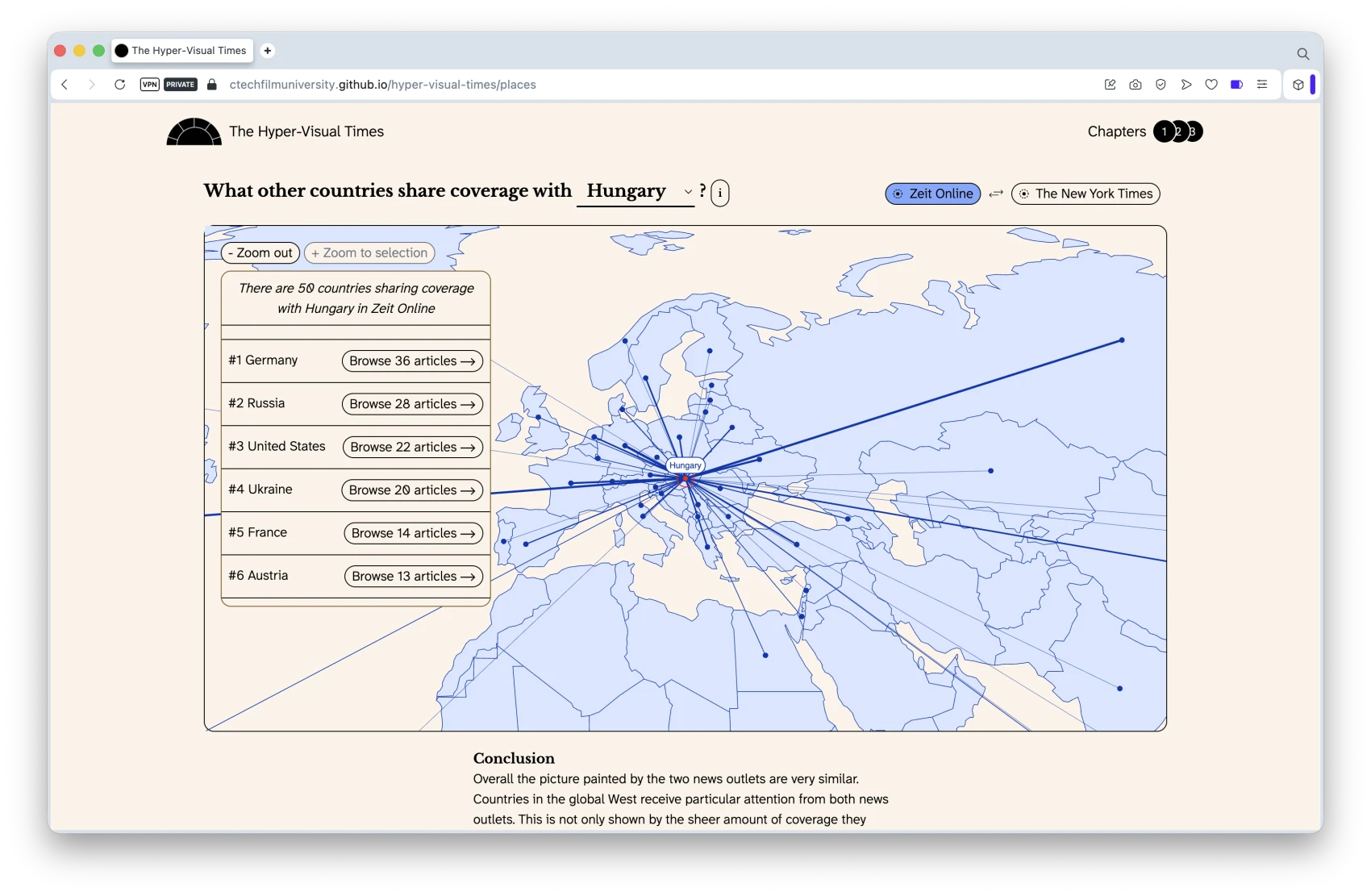
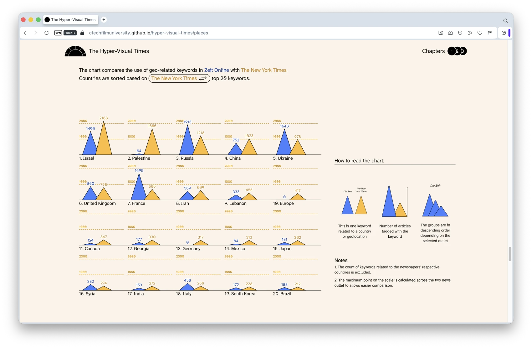
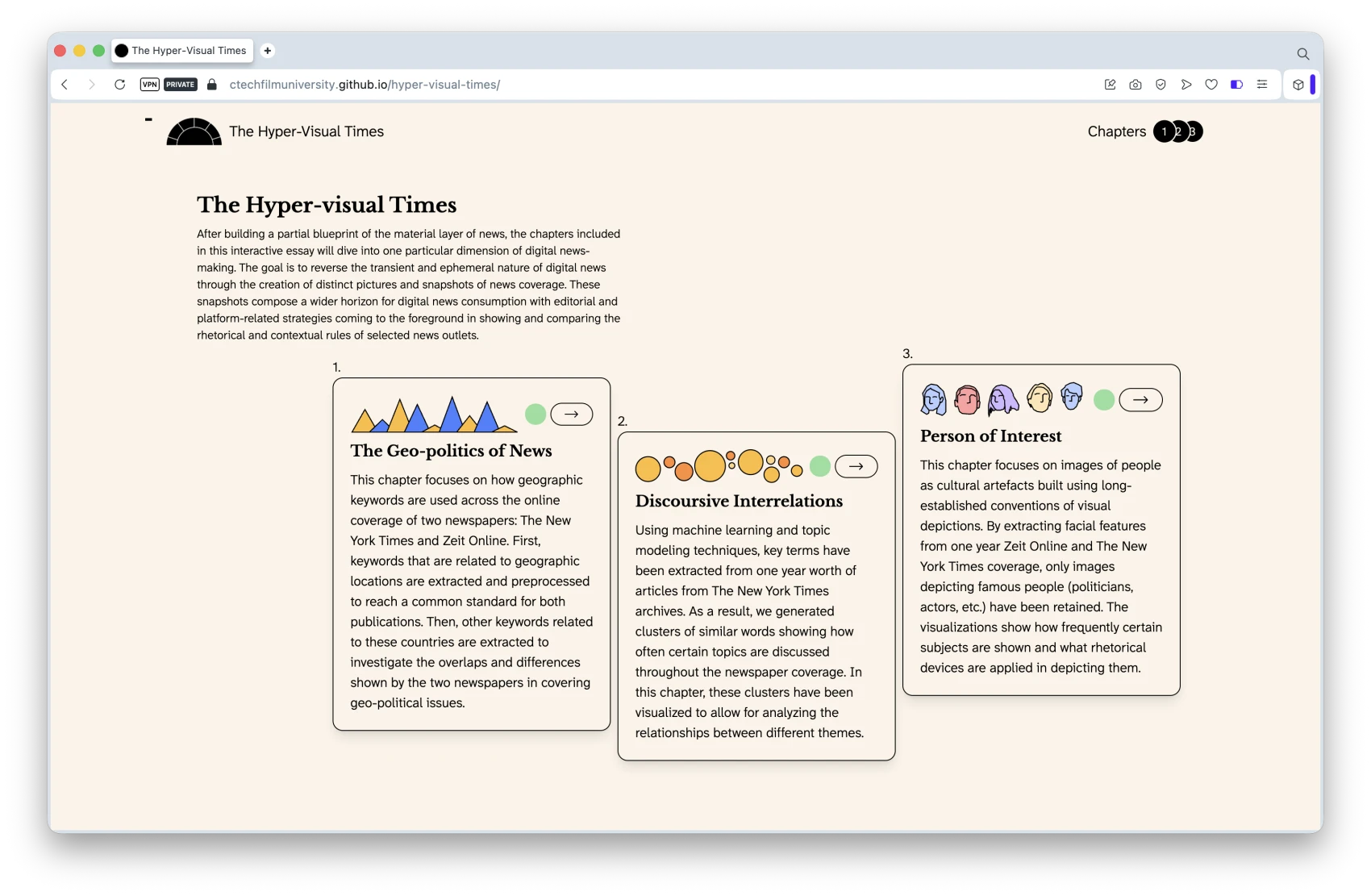
In The Geo-politics of News, geographical entities are extracted from individual articles and used to uncover the geopolitical alignment of newspapers. In Discursive Interrelations, the textual metadata of news pieces are aggregated into clusters of topics – exposing recurrent relations between topics in the New York Times. In Person of Interest, all meta images included with articles have been processed with a facial recognition algorithm and then clustered together to showcase who the most represented people are over the course of one year of coverage.
Scope of the Project
Results bring forward some of the underlying mechanisms of journalism and put archives of newspapers up for grabs, not only as reflection and critique of current journalism practices, but also as evidence to the potential of data visualisation in supporting readers' experience with news content on a large scale.