Visualizing News Data
Some personal thoughts on opportunities and challenges
Few months ago I started working on a research project with the idea of visualising historical and contemporary news discourses. The main idea is that we can generate insight from monitoring the unfolding discourses of contemporary digital news. This essay includes some considerations on the data scouting and preparation, a process that lead me to think very hard about news items as a data source for visualisation. I took some time to write down some of these thoughts, because the reliable access to news data would have been almost impossible, without relying on commercial services. Arguably, the lack of open archives for digital news poses an issue to historical research about contemporary news production. In the following paragraphs, I describe the state of the art of digital news data. Then, I propose three experiments that show the potential of news data for visualisation research. These example show the different perspectives of contemporary digital journalism that could be explored through collections of standardised news data.
Archival of digital news data: state of the art
To this day, we can very much rely on digital archives of physical newspapers. These archives are often public, maintained by libraries, tech companies, or the news outlets themselves. Newspaper pages were scanned and archived to be made available for consultation well past their original publication date. Whereas there are several resources to freely access historical printed newspaper, like the one in Figure 1 (e.g. 1, 2, 3, 4), digital news data have apparently obtained much less attention. Nowadays journalism is mostly produced for online publication. News has quickly diversified into several formats, aimed at different platforms and audiences. Variety, coupled with the increasing volume of news and its fast-paced publication, results in a paradox: we live immersed in a constant flow of news, but we can only temporarily capture very subjective and local fragments of it. This situation has a very pragmatic implication: in looking for news data from online news outlet, I almost could not find any publicly accessible archive. Almost no news outlet has programmatic access to their own archives available to the public. The New York Times is an outlier, offering an official API where the metadata for each publication is stored. This is the result of a systemic issue: the majority of online publications does not seem to have a systematic strategy for archiving their content, aside from regularly backing up servers and databases (which is arguably very different). There is even evidence of some outlets making questionable AI-powered decisions about their archives.
The lack of official APIs is partially balanced out by publicly-funded endeavours like Media Cloud and the European Media Monitor (EMM). As of today, EMM does not allow access to its API. Instead, Media Cloud can be considered one of the closest things to an archive of news. It is open and offers more than 200 millions articles from curated sources. However, the API does not provide with the article metadata or content – due to copyright restrictions. Technically, the content can be scraped – however, the task becomes complex when dealing with thousands of different sources and the various restrictions implemented by news outlets on their webpages. Additionally, the necessity for scraping information makes data prone to changes and does not enforce a consistent structure across datasets. For now, in the context of my research, I found that the most comprehensive way to obtain current and historical news coverage is to use commercial APIs. These services provide access to articles, and most importantly, their metadata. Aside from being questionable for many reasons, I believe few of these APIs have a very good way to structure and dispatch information to their paying costumers. Some of them offer very comprehensive and well-structured news data. In experimenting with the sample datasets obtained from these APIs, I found several interesting avenues for media and visualisation research in the context of news production.
Some experiments with news (meta)data
Approach A: article categories and SEO keywords – A low hanging fruit in experimenting with news data is to work with public categories and SEO keywords. Possibly, these terms are explicitly set by authors and/or editors to publicly categorise a specific news entry. These public keywords are intended as navigation anchors for readers, they make sub-sets of interrelated news item accessible. SEO keywords are more difficult to define. These terms only partially match public categories and are used to index the article on search engines. However, SEO keywords remain relevant, as they are strategically chosen to make the article perform well on search engines.
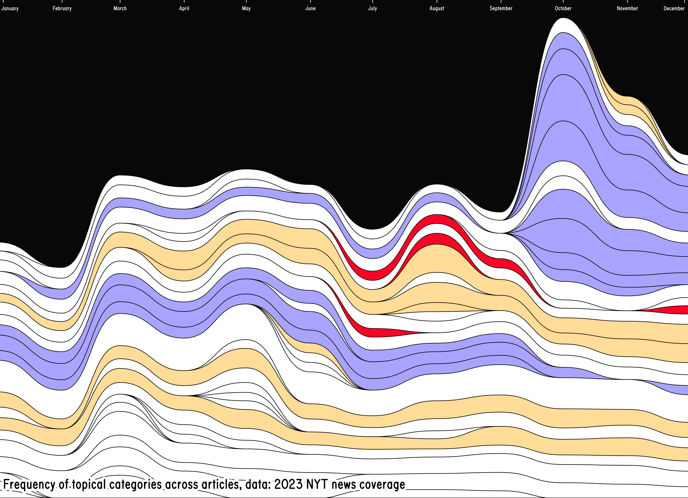
In general, I find categories and keywords particularly meaningful. They straddle a very adequate level of abstraction: they describe the article content, while remaining generic enough to match to more than one story. Also, these categories efficiently express the belonging of a specific item to a broader collection within a news outlet. Visualising categories means offering a historical overview of how important certain topics within daily news coverage. Such approach can easily rely on the metaphor of “flow”, which is a somewhat intuitive way to discuss (and visualise) news. For instance, TopTom (Gobbo et al., 2017) is a solid example of how to visualise a news data flow. The result is a visually straightforward and compelling stream of articles, distilled into their key concepts. Similarly, Figure 2 is a quick experiment I did visualising one year of New York Times along its most used categories. The visualisation shows the development of the top keywords (appearing in at least 100 articles) across the whole coverage.

Figure 2 shows a stacked area chart that represents the temporal development of keywords associated with war in the 2023 coverage from the NYT. The time is on the x-axis. the absolute number of times a keyword appears in the dataset is mapped to the y-Axis.
The different shades of yellow are categories related to the Russia-Ukraine conflict, whereas the different shades of blue are categories specific to Israel and Palestine. It is noticeable how importance quickly changes for individual keywords, as the second conflict explodes, in October 2023. This shows precise editorial choices within the NYT: one conflict surpasses another in how often it is covered with the new supplanting the old. Such approach is promising, but poses an important limitation: individual articles (and their context) are lost. An interesting challenge would be to implement in a more sophisticated level of detail, showing how groups of categories overlap over time and the individual articles they represent.
Approach B: Staging visuals – Header images are visual artefacts positioned at the top of every news item. Similarly to keywords, they have a double intended usage. Aside from being the main visual component of articles, they are also included in the head section of a webpage to be fetched as metadata and displayed as preview for the article on other platforms (e.g. social media, messaging apps, etc.). As such, they have a certain importance, when compared with other in-text images or multimedia artefacts. As the main visual, they are the main point of contact between the outlet and the reader. They are picked and/or designed to quickly attract and retain one’s attention. For this reason, I started to play with the idea of building a „hyper-visual“ newspaper. If we were to remove everything but images, how would news look like? I immediately thought of collaging, specifically these ‚90s-style diary entries and posters with “celebrity crushes”. Basically, cut-outs of the same face (belonging to a beloved actor or actress) are sampled from magazines and collaged together. I started with a sub-selection of my data: photos of people. After implementing a rudimental facial recognition pipeline, I was able to extract and mask almost all human faces belonging to one month of news coverage by the German newspaper Zeit. In Figure 3, a dump of some 100 cut-outs gives an idea of how such collaging could work out.

Figure 3 shows a wide set of cut-outs of faces extracted from the header images of Die Zeit. The cut-outs are randomly arranged on a rectangular surface.
This approach treats news articles almost as collection items. There are several examples of digitised museum collections, where the images become the main protagonist of the visualisation (i.e. ). In this particular case, the curatorial work of selecting only a certain type of image is done through computer vision. Among other projects, recent work from the GRADIM Team at the UCLAB Potsdam has brought evidence about how facial recognition and computer-enhanced curation could be an interesting tool for the digital humanities. I believe this could be true also for visualising news coverage. In particular, it could be interesting to see how the comparison between different outlets could play out. Especially to answer questions connected to visual culture and its impact on the presentation of contemporary news.
Approach C: Networks based on in-article links Digital news exists in a hyper textual environment, which allows for the cross-referencing of sources and articles. One article often contains hyperlinks pointing to other articles from the same outlet or external webpages. Visualising the incoming and outgoing connections from and to news articles poses an interesting approach to unveil the internal logics of publishing, where certain topics and items gain centrality compared to others. Such approach shows the different hierarchies and connections between topics, as related content always reference each other. Without even analysing the data, the first noticeable pattern is that news outlets tend to reference themselves. Links pointing to external pages (other news outlets, websites, etc.) are considerably much more rare than internal links pointed to the outlet own reporting. This evidence gave me the idea of designing a network of connections between articles within one news outlet. In particular, I find interesting the potential to show how one newspaper builds its own structure on a macroscopic level.

Figure 4 shows one month of coverage from the zeit visualised as a network. At the centre, one main cluster of articles is formed. Smaller clusters, composed by a handful of articles, are pushed to the margin of the canvas.
News items are not geo-referenced, but the network approach allows for a unique arrangement of individual entities in space. In Figure 4, articles are represented as nodes. If one article is linked to another, the nodes are visually connected to each other. The colour of single nodes express the main topic of the article. Only some items are consistently linked to each other. Some other constitute their own small constellation. The network unveils also the tendency for articles belonging to the same category to be close to each other, with only some nodes acting as “glue” between two or more different topics. What is missing from this experiment are the addition of external links, as well as a temporal perspective. These two dimensions are important. On the one hand, the integration of articles from other news outlets could show how different newsrooms influence each other. On the other hand, the addition of historical news data could show the “lifespan” of articles, revealing how certain topics evolve and what nodes remain the most relevant over time.
Final remarks
The creation and maintenance of programmatically-accessible online archives should be a priority of news outlets. I think there are several reasons why this is important. From a research point of view, the possibility to access machine-readable data that describe news items could foster new visual approaches to the dissemination of news outside of the platform-centric logic of social media. The reason why I decided to bring these example forward is to show what is possible to design with consistently archived and indexed digital news data. Beyond visualization and more generally research, the lack of archives of digital news restricts the freedom of citizens in accessing information. If only a small selection of outlets is able to consistently archive and disseminate historical news, data, these voices and perspectives will become increasingly central and possibly a benchmark for the interpretation of our societies and cultures. An archive of digital news data should not only include entries consisting of a title, url, or a snippet of text. Each datapoint should include key information such as byline, publication date and time, url to related multimedia contents, outgoing links, and SEO keywords. In other word, each archival entry should bear traces of the underlying publishing and commercial strategy of the newspaper, foundational elements that drive the logics of contemporary news-making. This way archival data about digital news could reflect the progressive evolution of newspapers in the contemporary age. In the wild era of predatory AI companies – this task is not trivial. It is important to design these archives as instruments for citizens and researchers, while protecting them from being looted by data-hungry crawlers.